

My MTA App Re-Design
To redesign an app to make it more understandable and functional so that everyone can use it.
Category: UX Research and Redesign
Tools: Figma, Miro, Mural
Context:
The project is part of the UX design course at NYU. I had 6 weeks to research, ideate, prototype, get feedback and present the solution. How do we make the app easier by implementing features, expanding the current feature, and making it more user-friendly to the community? At this particular point in time, the app takes time for the user to understand how it runs. Users spend a lot of time getting to know the application and how to navigate it. Rather than they would move on and use another navigation app for ease and to save time.
How do we redesign an app to make it more understandable and functional so that everyone can use it?
Research:
Users problem: Not being able to understand the flow and navigation of the app

User Journey map:
Creating a user journey helps to jot down the point of view for the usage of the app from the user's point of view.
Competitive Analysis:
The main takeaways from the analysis are Payment, Navigation, Information
User Interviews:
Conducted user interviews with 4 users: Two Students(new to NYC), Two working users(commuters).
Also conducted usability tests and a user survey for nearly 25 users and found out some insights about the problem and what they would like to see in the application for ease of use and travel.
Major Learnings through user interviews:
"To find the detailed places on the map and where to go"
"To know which stops are accessible because it would be useful for me to carry large bags"
"Too much information, hard to understand"
Problems Discovered:
Navigation trouble and immediate information
Instant payment or tap and go
Where is the transportation?:)
Takes time to understand the app on a busy day!

User Persona:
Goals:
To be able to reach her destination quickly at times when gets delayed for her.
Be able to get information about the transportation at her current location
Wants to check for alternative transportation at the location
Be able to pay quickly for the entrance
Pain points
Not able to recharge her card in the apps for ease
Entering and waiting at the wrong place for the train
Unpredictable subway train timings
Reading long alert messages for train delays and not being able to understand it
Designing:
Feature Prioritization
Should Haves
Must Haves


Style Guide

The Solution
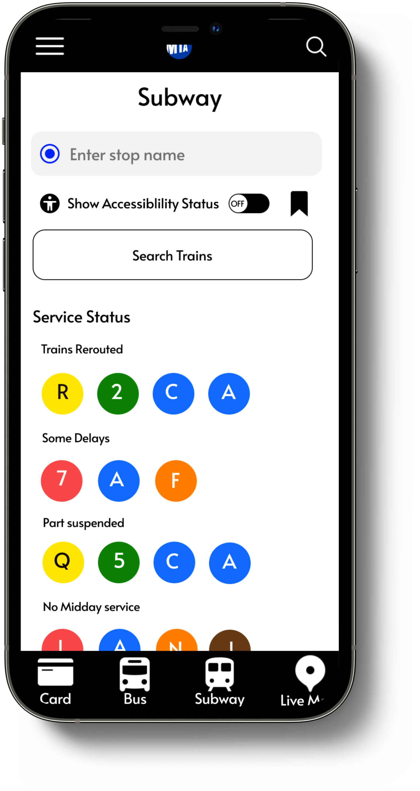


Accessibility feature added in the search. Many travel apps do not have this button and it would be essential to have the consideration for accessibility of public transportation
Conclusion:
The project helped to research analyze integrate and bring into consideration to make the app more usable and have a good user experience. I would like to add more features of navigation like integrating AR for navigating inside subways in the future.
Showcasing the case study to some of the MTA app UX designers would be taking the project to a next step